Brand Guidelines
These brand guidelines provide detailed information required to ensure that the Mimico Lacrosse brand is familiar and recognizable to players, parents and the community at large.
Logos and Spirt Marks
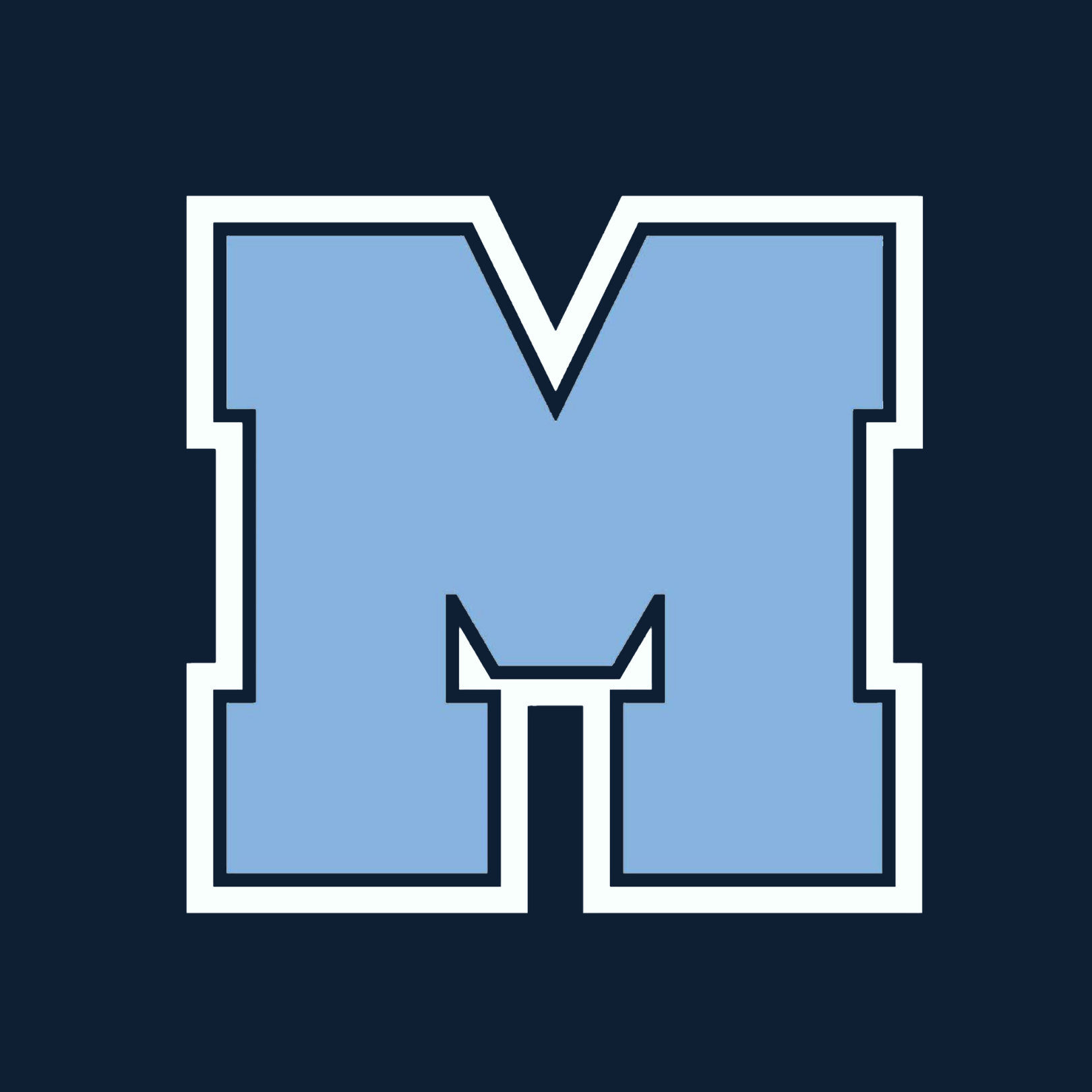
Primary Logo
The Mimico Lacrosse monogram logo and the colour palette of double blue are the primary identifiers for Mimico Lacrosse. They should always be used to represent the club in competition and high profile brand touchpoints, including but not limited to:
Official team uniforms
Playing surfaces
Formal communication
Broadcasts and score bugs
The Mimico Lacrosse monogram logo and the primary colour palette of double blue are referenced in our constitution and represent the history, tradition and legacy of our program. The monogram logo should always have a navy outline unless placed on a navy or dark background.
Spirit Marks
Mountaineers are a respected symbol of leadership — leading by example and taking pride in their duties and accomplishments. The mascot logos and vintage combination mark represent the spirit of Mimico Lacrosse. These brand assets serve as inspiring visual elements and embody our core values of fun, family, hard work, and tradition.
Program Submarks
Program-specific submarks provide consistency across the brand by sharing a common visual language. They assist in building the core brand while communicating the diversity of our programs.
Vintage Vault
These logos are retired and are no longer permitted for general use.
Brand Colours
Double blue is a fundamental component in our brand identity.
With colours rooted in the tradition of Mimico Lacrosse, it is important that they are always displayed with utmost accuracy. All printed colours should match the current Pantone chips that are up-to-date. The Pantone Matching System (PMS) is the authority for selecting, specifying and matching controlled ink colours.
It is not recommended to use independent combinations of white/navy blue or white/powder blue. These colour combinations will take away from the brand equity Mimico Lacrosse has built with the consistent use of double blue as its primary colour palette.
Oxford Blue
PANTONE 296 C
RGB 12 32 49
HEX/HTML 0C2031
Jordy Blue
PANTONE 283 C
RGB 146 193 233
HEX/HTML 92C1E9
Typography
Our brand uses five primary typefaces: Cooper Black, Draft Night, Graduate, Quotes Script and GT Walsheim Pro. These typefaces work together to bring our messages to life.
Cooper Black is the primary display typeface for our brand. The nostalgic typeface is a revival of the club’s mountain logo from the Barb & Ruby era.
Draft Night is the primary display typeface for our competitive programs. The collegiate typeface is primarily used for headers and subheads.
Graduate supports our type system as a secondary display typeface used mostly for our alumni and competitive programs.
GT Walsheim is a friendly but precise typeface used for body copy and captions.
Quotes Script is an accent font that is used in headers, callout copy or to emphasize important words or phrases.


